

OVERVIEW
During my 2022 Fall, I collaborated with peers to delve deeper in the human-centered design process. Our key question was on how interaction designers may reduce the unethical consequences of existing digital media. We zeroed in on cryptocurrency platform designs, aiming to make them more equitable for beginners.
OVERLY CONFUSING COMPLEX SYSTEMS
Web Development
User Research
MY ROLE
TOOLS
THE TEAM
TIMELINE
USER
Identify an appropriate primary user to design for and create a targeted interaction that modifies an existing product to support the primary user.
Designer
Responsible for UX design (ideation to wireframe to final prototype), UX research
Kavya Iyer Michelle Liu Olivia Xu
Oct - Nov 2022
Figma
GOAL
Our target users were first-time cryptocurrency site users or users with limited cryptocurrency knowledge.
The process of creating a targeted interaction that modifies an overly complex system started with identifying the system we wanted to target and our primary user.
Through our team sprint and primary + secondary research, we narrowed down the complex system to be crypto platforms, specifically Coinbase, and our primary user to be new or relatively new crypto users.
PROCESS BREAKDOWN
Following this, we utilized affinity diagramming to organize our research findings and created scenarios, along with storyboards. Using this as a starting point, we were able to design a lo-fi and mid-fi prototype.
At this point, we conducted user testing to drive the design for our hi-fi prototype. This process was used so that throughout the design process, the primary user was identified early and kept in mind with each new iteration.
In need of a more intuitive way to navigate overly confusing cryptocurrency sites and interfaces.
PROBLEM
Our users’ pain point was a lack of familiarity with domain specific terms (eg. Bitcoin, wallet, etc.) , so we focused on designing a solution that would allow them to understand said terms and navigate the site with ease.
Research + Synthesis
Ecosystem Collection Map
Many crypto platforms, such as Coinbase, require a lot of onboarding for a new user with information-crowded pages and unexplained terminology. Creating this map allowed us to identify the issues with a complex system, such as a crypto platform, as well as who these issues were harming.

Research + Synthesis
Secondary Research
Unfamiliarity with terms and concepts for a new crypto user causes users’ inability to become a regular user due to a steep learning curve with little guidance. This creates a divide between new users and experienced users.
Coinbase involves the idea of crypto and wallets, but for a new user, all of these complex terms and features are confusing, driving away new users.
Articles referenced for our redesign focus areas
Research + Synthesis
Primary Research
We conducted interviews with our primary user to identify the harm caused by existing crypto designs + discover unmet needs. We found that new crypto users need to go out of their way to learn about crypto, which leads to giving up on using crypto platforms.
Ecosystem Map

Interview Script
Research + Synthesis
We used affinity diagramming as a technique to discover themes and underlying needs from our research findings, which included complex information finding, difficult learning process, and lack of trust + transparency.

Affinity Diagram

Brainstorming + Creating
Scenario Storyboards
Our goal was to reframe a single pain point from our research to drive different solutions, and generated several “How might we…” questions based off of our previously discovered pain points.
We each crafted different scenarios to think through new solutions to improve our primary user’s experience when using a crypto platform in order to promote empathy within the system, focusing on the primary user’s perspective and 1) capturing the problem, 2) actions taken, 3) reaction of others, and 4) results from taking action.
We received feedback that stated to avoid showing the actual interface, to make clear the context, problem, solution, and resolution within a storyboard, so that we can translate these storyboards into initial working prototypes.
Brainstorming + Creating
Wireframes
After reviewing our individual storyboards as a team, we selected our screen-based interaction as being a hover interaction over domain-specific terms within Coinbase, with the aim of targeting unexplained crypto terminology used in Coinbase.
We then created our own lo-fi wireframes, and selected aspects from each design (eg. explanation of beginner mode + dimmed background to emphasize current panel) to merge them into a single wireframe, which we used as the basis for prototyping.

Lo-fi + Mid-fi Prototypes
Lo-fi Prototypes
Using our group wireframe as the basis for prototyping, each team member created a lo-fi prototype using Figma.
Focus: adding real content, functionality, and enough detail so that a user could actually imagine what the design does and how it would help them


incorporated a grid structure of 3 rows and 4 columns to create visual consistency within our dashboard
considered progressive disclosure and sought to have the user only focus on the dashboard for now
played with size and text to really emphasize the beginner mode
expanded descriptions for each hover interaction to provide the user a more in-depth explanation
experimented with typography and emphasized important aspects with both a larger sized and bolded font (e.g. “My Cards” → important for a user to see how much money they have immediately at first glance)
Lo-fi + Mid-fi Prototypes
Mid-fi Prototypes
We created a mid-fi prototype as a team, focusing on making refinements and adding interactivity. Given that we are modifying an existing platform (i.e. Coinbase), we sought to emulate the existing dashboard design and to build our hover interaction on top of that.
Focus: key design decisions (content, grid, feedforward + feedback), interactivity


Interactivity
added in search bar
incorporated dimmed background on hover, in order to bring more focus to current bubble and give the user more feedback
added actual hover interactions that worked in prototype mode, rather than just different screens showing what they might look like
fully fleshed-out side menu
Updated Grade System
margins integrated into grid to make sure left and right margins are more unified
gutters added to maintain more consistent spacing
more defined rows & columns to create standardized alignment points & spacing
Merged lo-fi Prototype
Hi-fi Prototype
User-Testing
Process
We conducted interviews of people who had little to no crypto knowledge, making sure to ask the user to complete a task, watch, and measure their success, as opposed to showing how to do it.
Scenario + task: participant has downloaded Coinbase for the first time; using the prototype, navigate around the dashboard to understand the meaning of all the information that is being displayed.

Interview Script
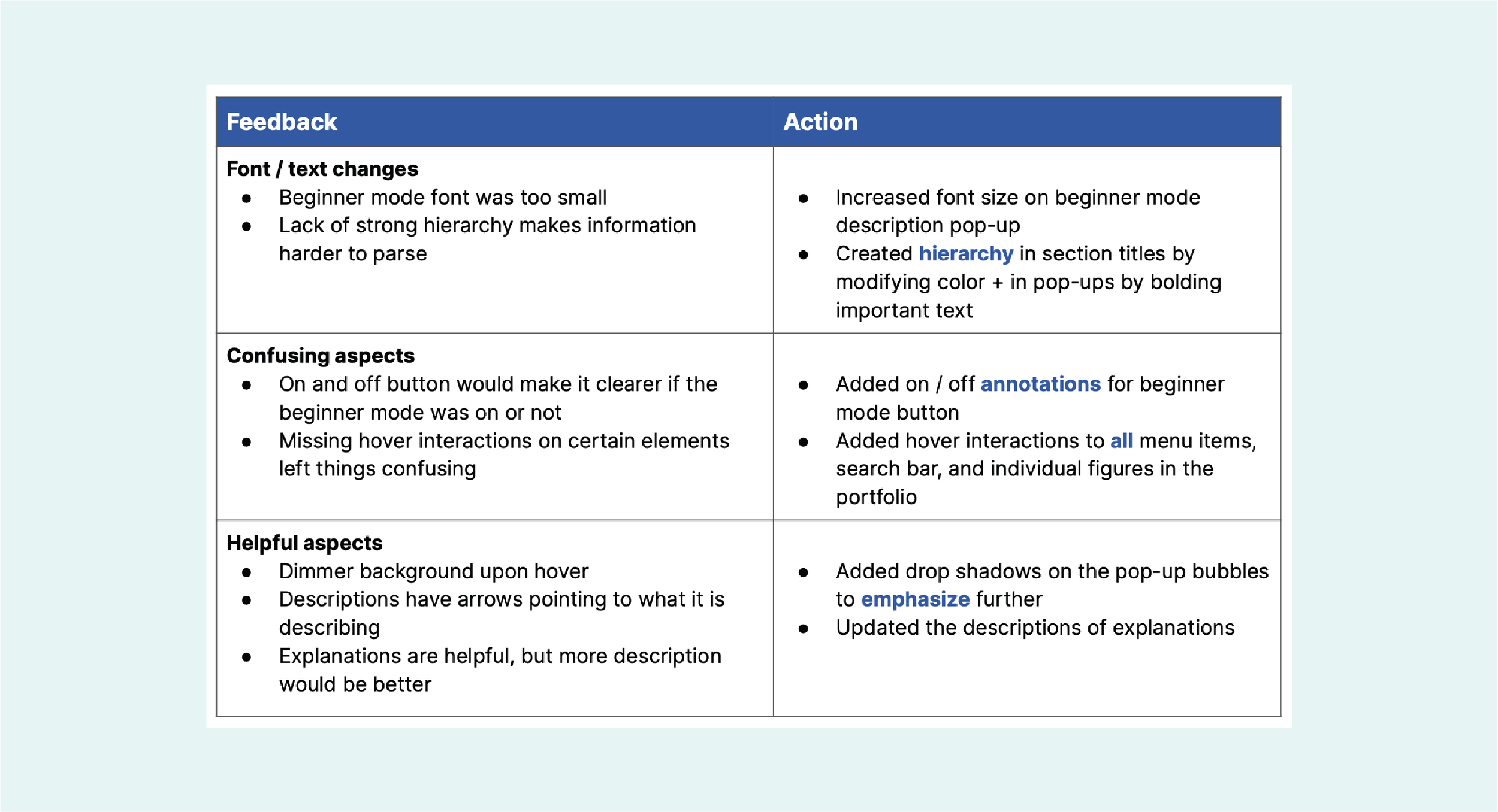
Feedback
Hi-fi Prototypes
Typography + Color
As we had a solid design for our prototype based on feedback from earlier stages, we decided to focus mainly on incorporating color and specific typography to make our design more effective and have a more ‘cryptocurrency site’ feel.

Typography
We decided on Raleway as our typographic element for its modern, sans-serif look and common usage in tech websites.
We created hierarchy by using varying font weights and sizes for headings, subheadings, and body text.

Color
We wanted a high tech / futuristic look for our design colors, so we decided on blues, mint, gradients, and glowing white drop shadows.
We used primary and secondary colors to add typographic hierarchy.
Made the beginner function stand out
Used a contrast checker to ensure accessibility
Hi-fi Prototypes
Response to User Feedback
After applying our final design decisions, we decided to run a last test in order to find any last pieces we missed.

More hierarchy
Each pop-up now has a title for users to quickly see the purpose of the item hovered, important terms and information are now bolded to create emphasis, and sub-headings are bolded.

Hover Interactions
New hover states added based on gaps of knowledge found in user-testing feedback.
Not only did I gain more Figma experience, but I learned how to clearly identify and understand the context, such as the user and the problem, to create an efficient solution. I realized the importance of preliminary research so that I can better plan for the remainder of the project and keep consistency throughout, which was especially helpful as I did not have much knowledge on our prompt, cryptocurrency, and I had to work in a group where communication is key. To continue on the same line, I found that projects like the sprint and ecosystem collection map aided my group in honing in on one problem, and brainstorming solutions for it.
Had we not have done so much preliminary (primary and secondary) research for this project, I feel as though we would have had many communication problems and wasted time on being confused, as this topic was all fairly new to all of us and there was a lot of room for error.
The process of wireframing (lo-fi to mid-fi to hi-fi) was interesting and eye opening, as we all had differing ideas and executions based off of the same research and conversations. I believe that having us make our own individual ones to combine into one at the end helped us make our project more well-rounded and translatable to a more general audience. I was further intrigued when I saw that, even though we had different ideas and made our idea more well-rounded, it was still lacking in differing points of view. This was made clear by our user-testing, as we received differing opinions and critiques about the prototype that we had not thought of or caught. I believe that no matter what, there is always room for improvement, and it is important to gain as many different perspectives as possible in order to get closer to an efficient and universal solution.
Something that could go wrong with our prototype is that the crypto world, which is already such a fast-paced environment, could change rules or terminologies faster than we can update them. Our prototype is not something that could apply forever, some aspects (like the articles or explanations of the chart) may need constant updates.
